Alliance of Small Island States
Site refresh

Alliance of Small Island States
United Nations
JUne -July 2021
aosis.org
AOSIS approached us for a site refresh. They already has a wealth of good information but they wanted to improve the discoverability as well as the look and feel. The challenge was we had to take the legacy information and make it fit within a Wordpress template.
The problem
It is hard to find relevant information to learn more about what the UN is doing within the islands.
My role
Curation, interaction design, branding, content organization, information architecture along with a small team of project managers and developers. The client teams was 5 directors within AOSIS.
Previous state

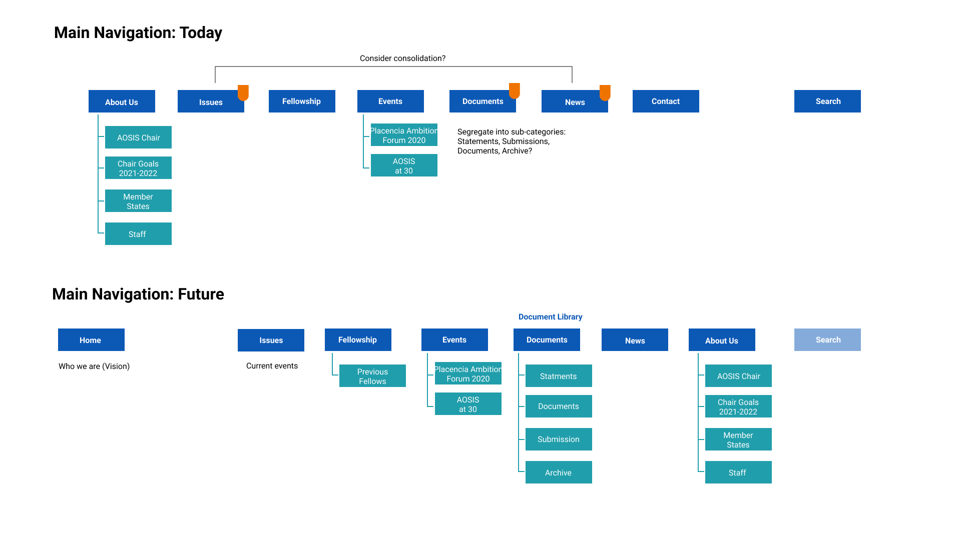
While not much has changed for the overall navigation we did rethink how the information was presented a level deeper. We added relevant documents to the “Issues” page and overhauled “Documents” to be a “Document Library”. We discuss the possibility of unifying the “Issues”, “Documents”, and “News” pages under a single page but decided to keep them as separate pages in order to allow the client to scale the content of those individual pages in the future.

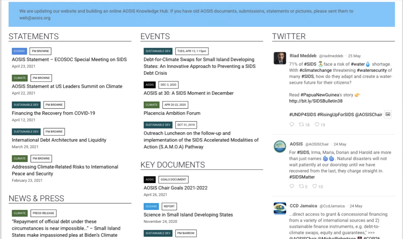
The previous “Home” page had a lot going on. We streamlined some categories to reduce redundancies. We also standardized how document meta data is shown, in this example the date and authors are presented as tags we wanted to get away from non tag items being presented as tags.

The previous “About Us” page didn’t have a cohesive style, the navigation between the pages only happened within a drop down on the top nav. In the redesign we unified the styles and provided a way to quickly move between the subpages within the subpage itself instead of within the top nav.

The previous “Documents” page didn’t allow a way for user to search through the information, the documents shown are only a small amount of the total available. The styling between a document and news item was too similar. Initially its was hard to see the difference between the documents and news page, it appeared redundant due to styling but these pages did indeed serve different purposes. The contact page was only a label with the email and phone number which was the exact same information within the footer (this page was also hard to read and failed accessibility guidelines). Since the client didn’t want a contact form we decided to eliminate the contact page altogether since the relevant information was found on the footer.

The previous “Issues” page was just 3 paragraphs, that’s it, there was no additional information or context about each issue. In the redesign we added relevant documents to the issues page and now since this page has more structure the client is able to scale this page with more content in the future. For the fellowship page we updated the styling to match the rest of the site.
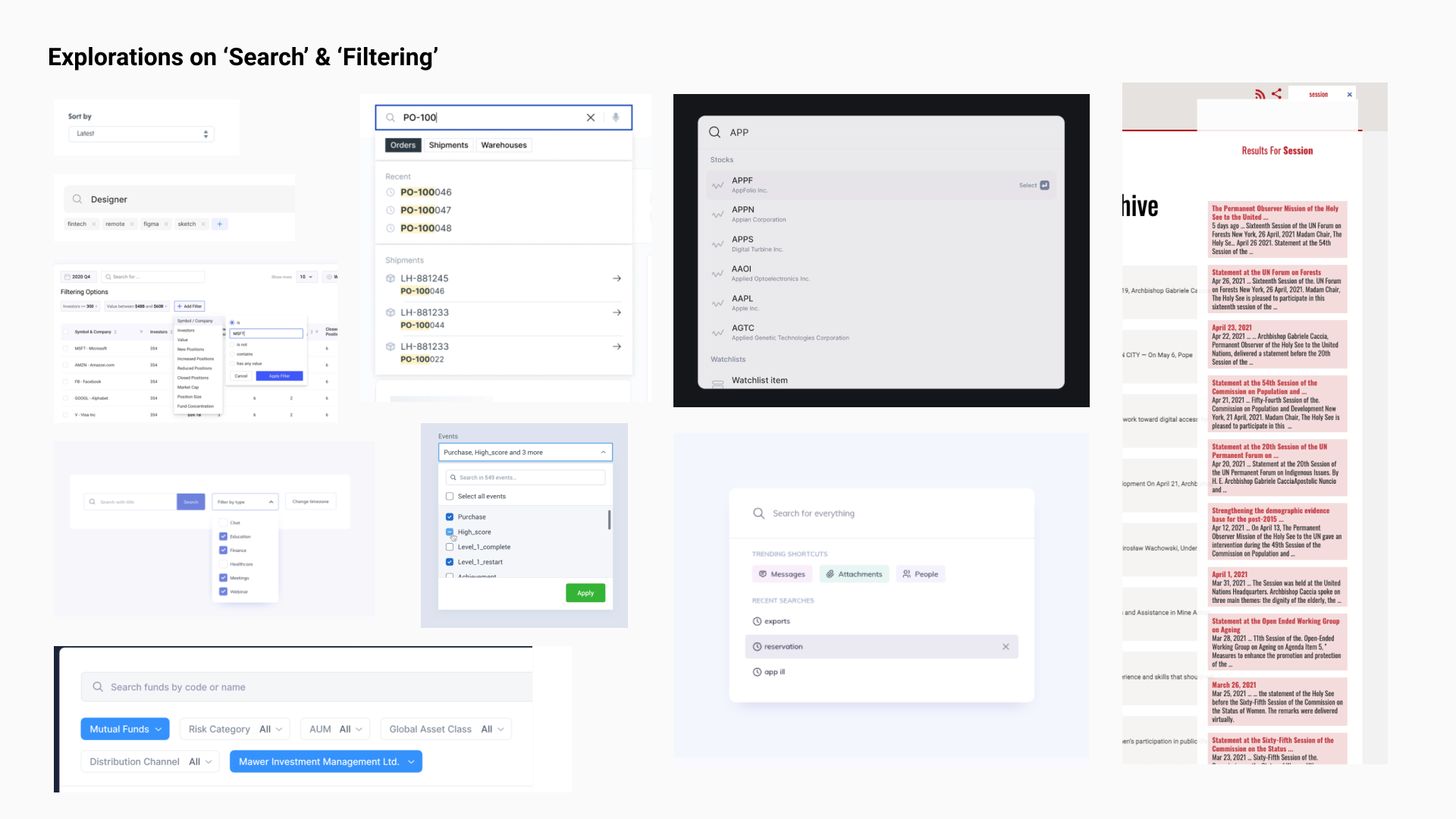
After styling we spent a lot of time optimizing the “Documents Library” and it’s filtering capabilities.

The client wanted all applicable filters present so that they can filter and cross filter across the hundreds of documents within the site.

Filter exploration

This is the design we tested with users to ultimately comes up with the solution below.

This solution for the “Document Library” allows the user to easily apply and remove multiple filters to find relevant documents.
Below is a recording of my final prototype before we developed the site. The developer and I worked closely together to bring this design to life. You can find the finished product live at aosis.org
Impact
Colorful updated site that is a delight to browse
Powerful document library that allows people to find a specific document 4x faster